31 Jan, 2023
10 Call-To-Action Button Examples to Convert Visitors

It is impossible to convince people to go through your sales cycle. Customers today are more cautious than ever and don't like the idea of a brand influencing their decisions. Therefore, we must consider the user's journey through the site when creating a web page. Browsing the content should lead to a specific action, such as purchasing, contacting, signing up for the newsletter, etc. A "call to action" button is essential to increase conversion rates when used.
It all comes down to encouraging potential customers to complete an opt-in form or share a blog post on their social media channels. And you can do this using a simple but effective "call to action" button.
Here, we'll discuss what a CTA is and provide some examples of effective CTAs with a high online conversion rate.
What is CTA?
CTA is an initialism for "call to action." The term describes an element that directs users to another page on a website or enables them to perform a specific action. It typically appears as a button or link visitors can click to go to the next step of the journey, such as requesting a demo, downloading something, completing a purchase, etc.
The following action words are most frequently used on the internet:
- subscribe
- learn more
- get started
- try it for free
- download
- sign up
CTAs come in various forms, and all strive to encourage users to take specific actions.
When used, a CTA keeps customers on track and points them in the right direction by acting as a portal throughout the customer journey. A call to action button can appear in different places on a website (e.g., blogs, subpages, a form, a pop-up, etc.). CTAs are generally most effective when their placement is well thought out.
What Is the Importance of a Call to Action?
- Maintain users' movement: Visitors could be confused about what to do next if there is no clear call to action. Even if you've planned an incredible journey for them, they won't be able to experience it if they don't know how to proceed. It might soon result in a slow-moving sales cycle that doesn't convert as well as expected.
- Assist in developing the customer journey: A conversion occurs when a visitor responds to a CTA. Conversions are simple to track because most software shows how many people have clicked a link or moved from one page to another. It makes it simple to monitor the customer journey and trace customers' steps to purchase.
- Making measurement simple: You can track and measure each call-to-action as a small conversion point. You can enhance the sales cycle by knowing which CTAs consumers respond to the most and what they do next.
- Boost conversion rates: Customers nowadays are busy. Over 90% of visitors to e-commerce websites read call-to-actions, although they don't have time to read every word on a page. So your chances of increasing conversions grow with the number of eyes seeing your CTAs.
- Immediately take action: Since users' response times are at an all-time low, keeping them interested and moving through the selling process is critical. CTAs enable this by providing consumers with intense action points to engage with.
Generating and converting leads is the main goal shared by most marketers. Yet, capturing the dwindling interest of an audience that is becoming more independent when you are up against hundreds of other comparable brands can be challenging. But, by grabbing their attention, piquing their interest, and guiding them through the signup or sales process, the call to action button keeps your audience on track and progressing.
CTA Button Examples
You can classify call-to-action buttons based on the developers' intent and what actions they expect from customers. You now understand what a call-to-action is and what it implies for a business and a marketer. The examples below will help you figure out how to write or create a good call to action button.
Wix.com
We inspire first-time users to start something extraordinary for themselves when we ask them to develop a website. A company website, an online portfolio, a free blog, or a digital CV are all options to create a great future. The CTA on the Wix.com homepage is designed to encourage this. It says "Get Started," which is intended to convert the lead and encourage them to create an account with Wix.
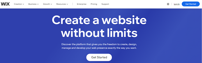
Call to Action Button: Get Started
Slack
The homepage of Slack has a navigation menu that provides access to additional information, including pricing and other products. More CTAs like the "Try for free" and "Talk To Sales" buttons stick out in this instance. This simple website layout encourages users to move forward in the buying process.
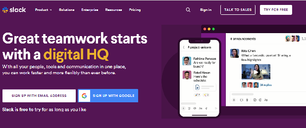
Call to Action Button: Talk To Sales and Try For Free
Zoom
You can interact and connect to improve teamwork. Zoom powers the modern workforce and is easy to use and manage. It is well recognized as a leading video conferencing platform. All that is left is for its CTA to make a final appeal to potential customers: Sign up; it's free.
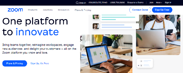
Call to Action Button: Sign Up, It’s Free
Get Harvest
It employs classic, minimalist CTAs, with the encouragement to explore all features of its solution on the front page. Also, it helps the potential consumer realize that the solution includes various tools and enables them to further surf the website and learn more about the offer.
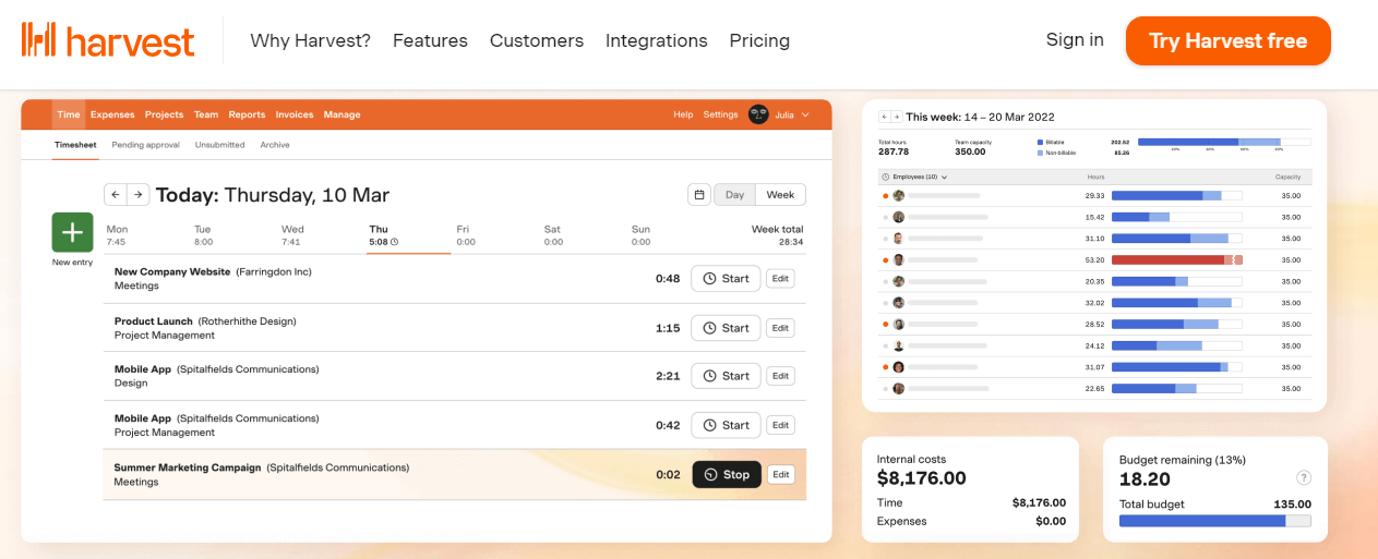
Call to Action Button: Try Harvest free
Shopify
The CTA that Shopify has chosen is a free trial offer. They illustrate the platform with scenes next to the intended action. This CTA is sufficient for a well-known company like Shopify; clear information is often needed to click on such buttons.
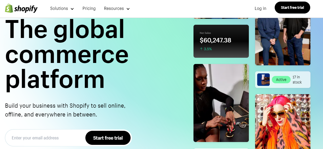
Call to Action Button: Start free trial
Lasik MD
A CTA is used on the Lasik MD ophthalmology clinic's website to encourage customers to register for a free consultation and schedule a face-to-face visit. The eye-catching blue color identifies the button in the main menu. The button is impossible to miss due to its location and color choice. So, the visitor knows they can take advantage of the offer from the very beginning of their visit to the website. The user is taken to a form where they may make an appointment at the clinic after clicking on this call to action.
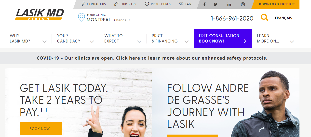
Call to Action Button: Free Consultation Book Now
Indochino
On the Indochino home page, the call to action (Book an appointment) is placed immediately below the fold line. Compared to other page elements, the CTA stands out by using contrast (white text on a black button). The user is directed to a map where they can choose their desired location and click the "Book Now" option after choosing this call to action. Then select the choice from the list that best fits the reason for their visit, and the next step is to determine the calendar day that works best for them.
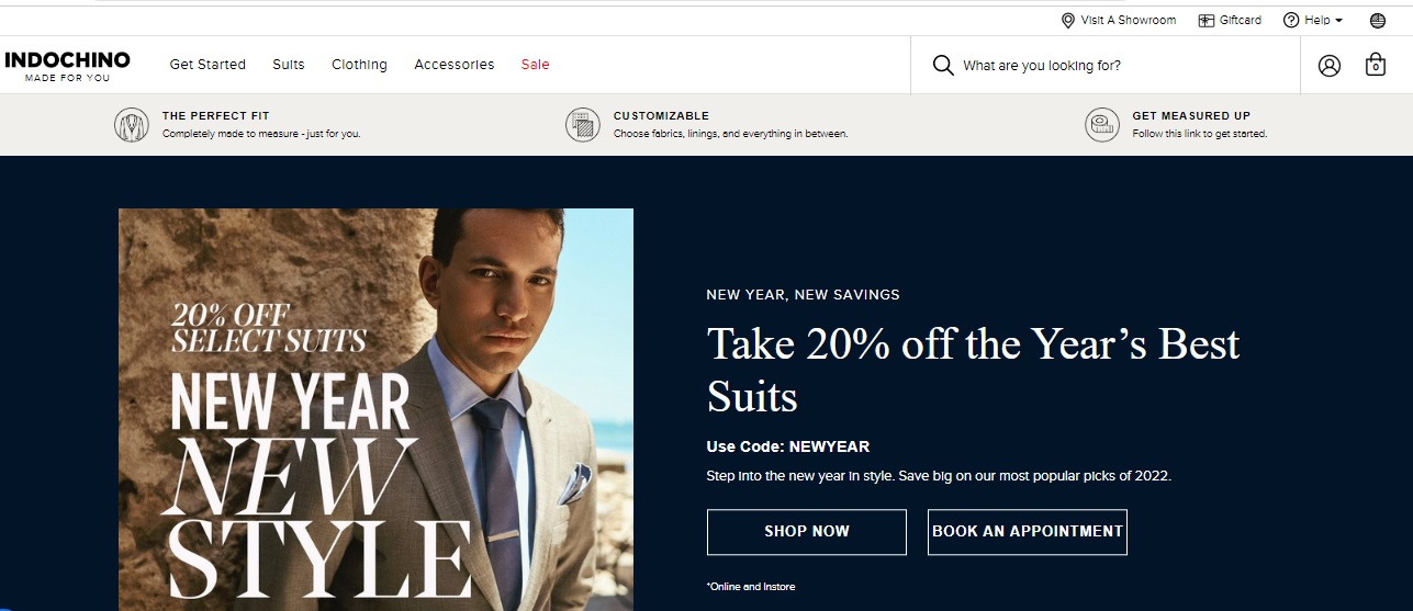
Call to Action Button: Book an Appointment
Backlinko
On the Backlinko website, the hero section contains the CTA. It makes it simple for the user to locate it even if they decide not to use it immediately after arriving at the website. Under the customer reference and the header outlining what the user will receive if they submit their email address is the single box to enter an email address and the "Try It" call to action. A CTA used in this way makes it simple to quickly collect more addresses for the mailing database.

Call to Action Button: Try It
Full Bundle
The white CTA button that indicates "Our Work" stands out against the dark gray background. Since their primary goal is to improve their client's online presence, they must prove their online presence first. So, the advertisement is designed to show that their work combines creativity and logic.
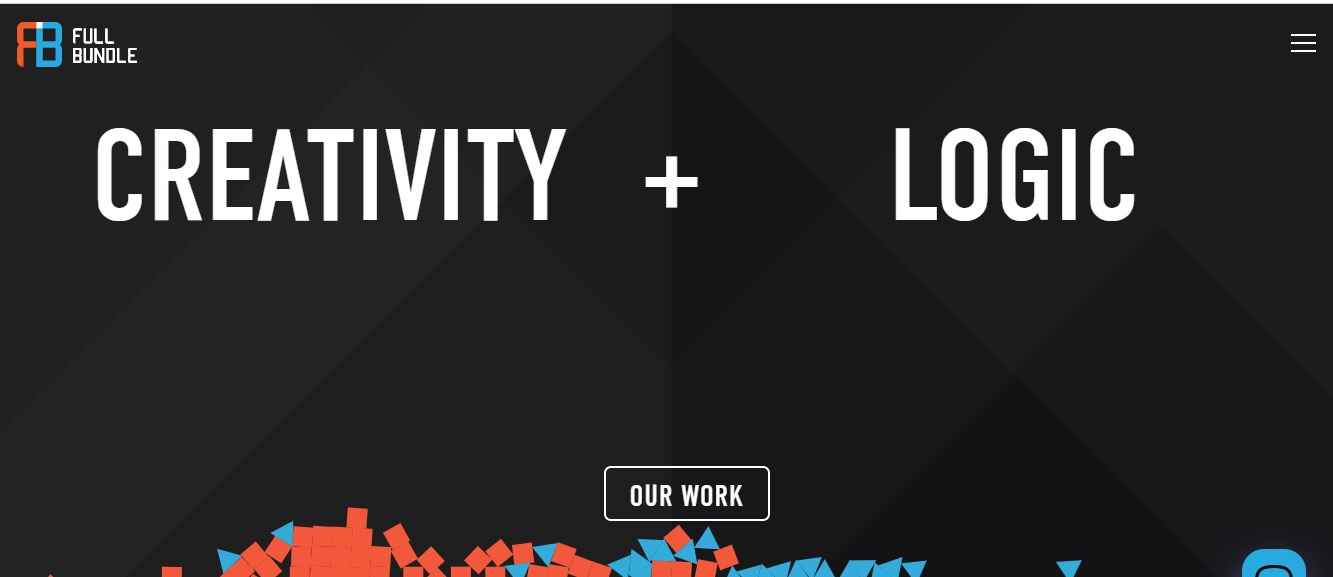
Call to Action Button: Our Work
charity: water
It is a non-profit organization that works to provide clean and safe water to people all over the world. This site's CTA helps evoke emotions. Also, it's unique as it allows the viewer to donate once or monthly. It simplifies the process for the viewer looking for convenience online.
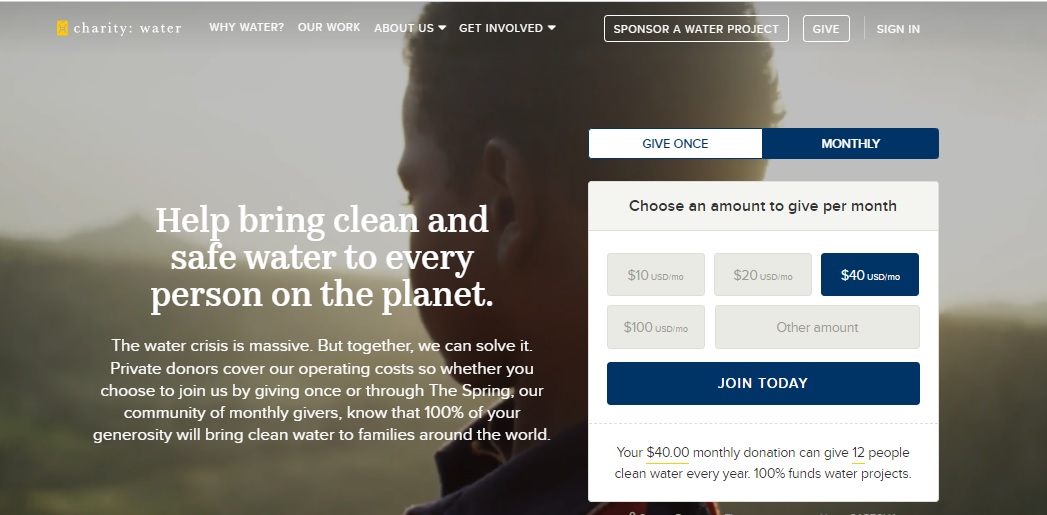
Call to Action Button: Give Once or Monthly
Important Key Points
- A call to action button is an essential component of any advertisement. But, appropriate attention is taken when drafting the same.
- The CTA button examples are clear, precise, accurate, and to the point.
- Use strong action words in your CTA to direct the user to the next step.
- Call-to-action phrases must evoke an emotional response from potential customers. Many customers who buy products based on online advertisements do so. This behavior is the result of an effective call to action and marketing.
- It's also important to consider how a CTA is designed: colors and fonts impact potential customers' decision-making abilities.
Conclusion
Your CTAs may be a small component of your website, but they represent one of the most important. When a user clicks on it, some action occurs, such as the appearance of a message, form, or login field, or the user is transferred to another page within the given site (e.g., a contact page) or outside of it (e.g., to a landing page).
In addition to content, you should be aware that the landing page call to action is essential to entice visitors to take the desired action. Use CTAs to achieve the best landing page optimization and allow your new visitor to get to know you. The call to action button isn't for sales; it can create a customer path within the web page, generate leads, and promote the brand. We provide full-service user experience (UX) and user interface (UI) design.