They are not wrong when they say “First Impression is the Last Impression”. An average user decides in the first 8 seconds if they want to explore the website further. Think about it - what does a user see in the first 8 seconds on your website? There’s not enough time to read much, and hence, it always comes down to how it looks and feels. A website is your company’s first impression and it’s UI is its fashion sense. It’s bound to get outdated and need makeovers with the ever so changing trends!
Arguably, your website is the most important element of your digital and overall presence. Make sure you use it to communicate your key elements to your audience effectively.
Although there is no written way of going about a website revamp, here’s a quick, simple guide to get you on the right path!
1. Always begin with the “Why”

If you’re thinking of giving your website that facelift and a brand new UI, begin, as always, with the ‘why’. As we progress in our business, at every step, we gain a better understanding of our target audience, and consequently, a better interface. As we do so, it is important to align our website to our understanding. Making the perfect website doesn’t involve making something appear with a magic wand, it is more building something, brick by brick.
Secondly, according to research, the life of a website design is 1.5 years. Beyond this, it tends to lose it’s edge and starts to get overlooked.
There could also be a lot of other reasons for you to want to change your website. For instance, it might not reflect your company’s vision or stand anymore. Alternatively, you might want to give your visitors a different user journey based on the changed focus of your products or services.
Keeping all the work you’ve already done for SEO in mind, everything else is just a step up once you decide to give your website a new look!
2. Content will always be the King, but the presentation is the Queen

Once you define the pages that you need, you have to give them appropriate and meaningful content. Make sure your UI takes your user through a simple, relatable and smooth journey through the content you create.
Once that is finalized, design, re-design and then re-design once more until you have a concrete and comprehensible wireframe that reflects everything that your company is about.
This stage is where you reach out to friends, family, and colleagues for feedback and get a sense of what they infer from your new designs. Make sure that what they understand is what you were trying to convey. Once your designs are final, it’s time to align your content too, making the perfect package.
3. Build away!

Now that you have your wireframes in place, it’s time to give it life!
There is no end to your options here. There are multiple ways to build a website. Don’t be the wrong person to make the right decisions! Instead of finding the best way, figure out the right guy or the right team who have a very good understanding of what works on the web and let them do their magic in whatever way they choose to wave their wand.
To build an effective Content Management System, you can either develop a theme along with the CMS itself or build a theme separately and then integrate the two.
4. Are you ready to go live just yet?

Make yourself a checklist. Go through everything from the URL structure, the cross-browser and cross-device testing, meta tags, emails for forms, access control, and the entire front-end. The devil, however, lies in the details. Identify the majority of your audience and where they come from or what devices they use, and make sure your website caters to them well!
Check W3C standards, security, performance, SEO score, and ensure you are doing all things correctly. The first draft of the launch should be as close as 100% as you can. The more you compromise at the time of the launch, the more you will keep compromising in the future.
Phew! That was too much! Time to go live and celebrate the launch!
5. Don’t put it behind you just yet!
Even though your website is now live, you will always come across things that can be better. Take all contemplating feedback into account and constantly work towards seamless user experience.
Your work is never entirely done. As long as your target audience evolves, your product/service evolves and you grow, your website should evolve with you.
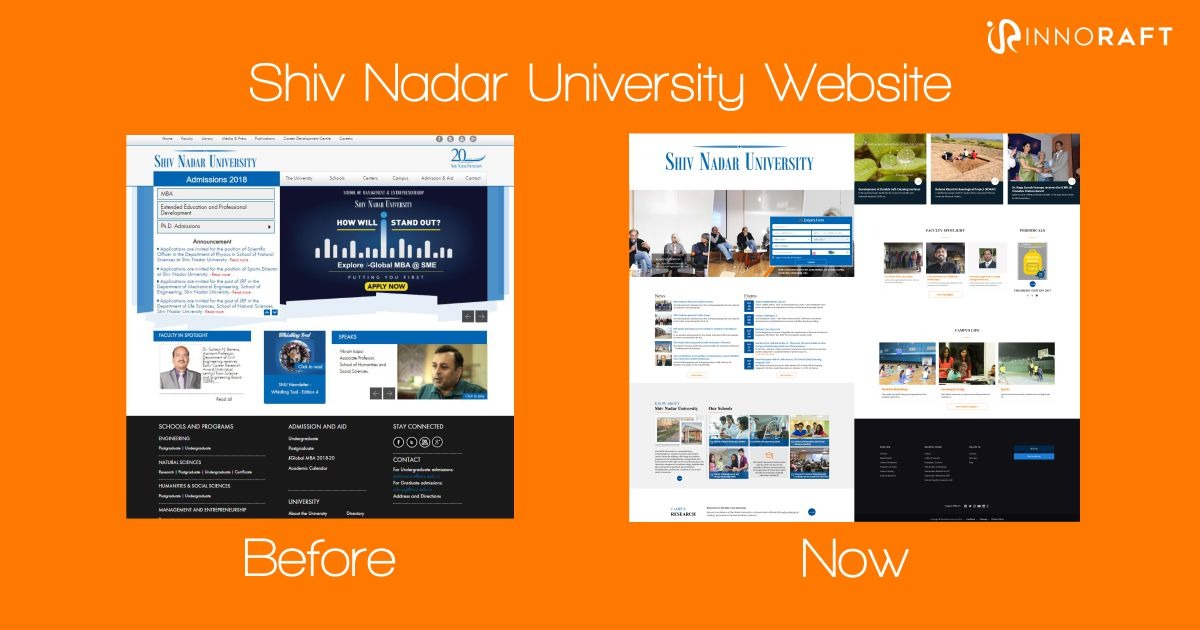
For example just look at the evolution in the design of the Shiv Nadar University Website revamp.

Always keep an eye out for inspiration. There is creativity in every corner of the internet if we’re willing to absorb it.
